
Overview
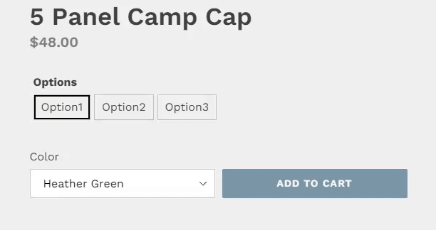
The text picker allows you to create selectable text buttons. They work similar to checkboxes in that you can select more than one options at a time.
Settings
These settings can be set or altered by clicking the blue gear icon that is located on the top right of the field when selected.
- Border Color
- Selected Border Color
- Allow Multiple Selection
Border Color
Use the color picker to select the outline color for the buttons.
Selected Border Color
Use the color picker to select the outline color for the buttons that will be used when the button is selected or when the user hovers over the button
Allow Multiple Selection
When this option is selected, the customer will be able to select more than one option at the same time.